

10 Actionable Conversion Rate Optimization Strategies for Modern Creators

As a creator, you pour your heart into building an audience and driving traffic to your digital home. But what happens when that hard-earned traffic doesn't convert into sales, sign-ups, or community members? It's a frustratingly common problem that leaves many entrepreneurs feeling like they're spinning their wheels. The truth is, more traffic isn't always the answer. The real key to sustainable growth is converting the visitors you already have more effectively. This is where conversion rate optimization (CRO) comes into play.
This guide breaks down 10 proven conversion rate optimization strategies designed specifically for creators who feel overwhelmed by technology. We'll move beyond generic advice to give you actionable steps you can implement immediately to turn your passion into a stable business. You will learn how to make small, data-backed changes that lead to significant revenue growth, all while simplifying your tech stack. For those looking to expand on these foundational concepts, exploring these 7 powerful conversion rate optimization tips can provide additional tactical insights.
Our goal is to help you transform your website from a digital brochure into a powerful conversion machine. Instead of juggling a dozen different tools, we'll show you how a unified platform like Zanfia can streamline these efforts, turning clicks into dedicated customers and community members.
Table of Contents
1. A/B Split Testing
A/B split testing is a cornerstone of data-driven marketing and one of the most effective conversion rate optimization strategies. It removes guesswork by directly comparing two versions of a webpage, email, or digital asset (Version A vs. Version B) to see which one performs better. By showing each version to a different segment of your audience simultaneously, you can measure which variant drives more conversions, whether that’s a sale, a sign-up, or a click.
This method allows you to make incremental improvements backed by real user data. For instance, you could test two different headlines on your Zanfia landing page to see which one convinces more visitors to sign up for your online course. Or you might test two different call-to-action (CTA) button colors on your sales page. A famous HubSpot study found that a simple color change from green to red boosted their conversions by 21%. The key is to isolate and test one variable at a time for clear, unambiguous results.
How to Implement A/B Testing
Executing a successful A/B test involves a clear, repeatable process to ensure your findings are reliable and not just a random fluke.
- Start with a Hypothesis: Begin with a clear, specific idea of what you want to improve. For example: "Changing the CTA button text from 'Learn More' to 'Get Instant Access' will increase course sign-ups because it is more direct and action-oriented."
- Isolate One Variable: To get clean data, only change one element between Version A and Version B. This could be a headline, an image, button text, or page layout.
- Ensure Statistical Significance: Use an A/B testing calculator to determine how many visitors you need in each group to trust the results. Running a test with too few people can lead to misleading conclusions.
The following infographic illustrates the essential workflow for conducting a reliable A/B test.
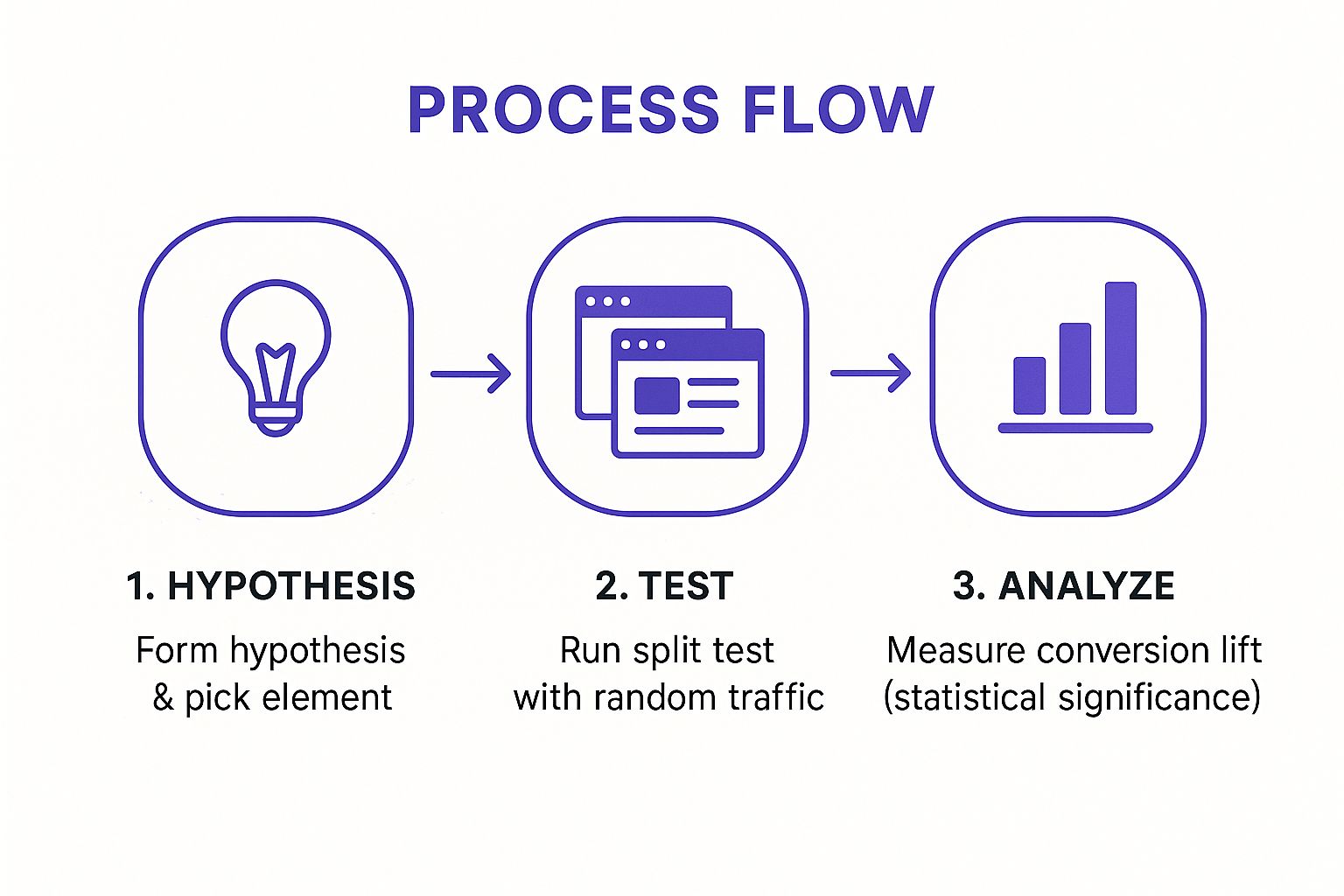
This simple three-step flow—hypothesis, test, and analysis—forms the core loop of continuous optimization, helping you make smarter, revenue-driving decisions.
2. Landing Page Optimization
Landing page optimization is one of the most powerful conversion rate optimization strategies because it hones in on a single, high-intent moment in the customer journey. These dedicated pages are where visitors "land" after clicking an ad or a link in an email, and their sole purpose is to drive a specific action. By creating a focused experience that aligns perfectly with the visitor's expectations and eliminates all other distractions, you can dramatically increase your chances of conversion.
This strategy allows you to create a seamless path from ad to action. For example, if you're running a Facebook ad for your new Zanfia-hosted course on digital photography, the landing page must reflect the exact same messaging, imagery, and offer. Dropbox famously used this approach with a simple page featuring an explainer video, which reportedly increased sign-ups by 10%. The goal is to make the decision to convert feel obvious and effortless for the user.
How to Implement Landing Page Optimization
A well-optimized landing page is a masterclass in clarity and persuasion. Here are the key elements to focus on to turn more visitors into customers.
- Match the Message: Ensure your landing page headline and copy perfectly match the ad or link the visitor clicked. This consistency, known as "message match," reassures users they are in the right place and builds immediate trust.
- Keep Forms Simple: Only ask for essential information. On your Zanfia course sales page, you can streamline the process by only asking for a name and email to get started, reducing friction and boosting sign-ups.
- Use Compelling CTAs: Your call-to-action should be specific and value-driven. Instead of "Submit," try "Get Instant Access" or "Enroll in the Course Now" to create a sense of urgency and benefit.
- Leverage Social Proof: Include testimonials, case studies, or reviews directly on the page. This builds trust and shows prospects that others have found success with your offer.
While focusing on individual page elements, remember that a clear and logical overall website structure significantly enhances user navigation and guides visitors effectively towards conversion goals. For a deeper dive into this foundational aspect, consider exploring resources on planning an effective website structure.
3. Call-to-Action (CTA) Optimization
Your call-to-action (CTA) is the gateway to conversion. It's the final prompt that guides a visitor to take the desired step, and optimizing it is one of the most impactful conversion rate optimization strategies you can implement. A weak, generic CTA creates friction and doubt, while a strong one provides clarity and motivation, directly impacting your sales and sign-ups.
This strategy involves testing every aspect of your CTA, from the button text and color to its size and placement. For example, Performable (now part of HubSpot) increased clicks by 21% simply by changing its button text from "Start Your Free Trial" to the more personal "Start My Free 30-Day Trial." This small tweak created a sense of ownership for the user. These minor changes can lead to significant gains by making the next step irresistible for your audience.
How to Implement CTA Optimization
Effective CTA optimization is a blend of psychology, design, and clear messaging. It’s about making the desired action both obvious and appealing.
- Use Action-Oriented, First-Person Language: Instead of a passive "Submit," try a benefit-driven phrase like "Get My Free Guide." Using first-person possessive pronouns ("my," "me") creates a sense of ownership and relevance for the user.
- Create Strong Visual Contrast: Your CTA button must stand out from the rest of the page. Use a color that contrasts with your Zanfia site's background but still aligns with your brand. The goal is to draw the eye immediately to the button.
- Strategic Placement is Key: Place your primary CTA "above the fold" so visitors see it without scrolling. You should also add CTAs at natural conclusion points in your content, such as after a compelling argument or at the end of a section.
Optimizing your CTAs is a high-leverage activity that ensures every page on your Zanfia site is built to convert.
4. Social Proof Integration
Social proof is one of the most powerful conversion rate optimization strategies because it taps into a fundamental human behavior: we trust the actions and opinions of others. This strategy involves showcasing evidence that other people have chosen, used, and valued your product or service. Displaying customer testimonials, reviews, user counts, and expert endorsements builds instant credibility and reduces purchase anxiety for potential customers.

When a visitor sees that hundreds of students have enrolled in your Zanfia course or reads a glowing review from a peer, it validates their decision-making process. For example, a creator could showcase logos of companies whose employees have taken their professional development courses. Similarly, displaying real-time notifications like "25 people just signed up for this webinar" creates a sense of urgency and belonging, encouraging others to join before they miss out. By leveraging social proof, you can significantly boost your conversion rates.
How to Implement Social Proof
Effectively integrating social proof requires a strategic approach to build trust and encourage action.
- Showcase Authentic Testimonials: Add a dedicated section on your Zanfia landing pages for detailed customer testimonials. Instead of generic praise like "Great course," use specific quotes that highlight tangible results. Including a name and photo adds a powerful layer of authenticity.
- Display User Numbers: If you have impressive enrollment numbers or community members, display them prominently. A banner stating "Join 2,000+ happy students" is a simple yet effective form of social proof.
- Leverage Social Media Mentions: Share positive mentions and user-generated content from social media on your sales pages. This creates a dynamic and current stream of positive feedback. You can learn more about how to effectively use your social channels in our guide on social media marketing for small businesses.
5. Mobile Optimization
Mobile optimization is no longer optional; it's a critical component of any effective conversion rate optimization strategy. This practice ensures your website, landing pages, and sales funnels provide a seamless and intuitive experience on smartphones and tablets. With Google reporting that 61% of users are unlikely to return to a mobile site they had trouble accessing, a clunky mobile experience means you're actively turning away potential customers and leaving revenue on the table.
This strategy focuses on responsive design, fast loading times, and touch-friendly navigation to meet users where they are. For instance, Walmart saw a 2% conversion rate increase for every 1-second improvement in mobile load time. For a creator using Zanfia, this means every part of your customer journey, from discovering your lead magnet to purchasing your course, must be effortless on a small screen. Zanfia’s platform is built with a mobile-first philosophy, ensuring your pages look and perform great on any device, right out of the box.
How to Implement Mobile Optimization
A strong mobile strategy goes beyond simply having a site that shrinks to fit a screen. It requires a thoughtful approach to design and functionality.
- Design for Thumb Navigation: Place key interactive elements like CTA buttons and menu icons within the "thumb-friendly zone" at the bottom and center of the screen. This makes it easy for users to navigate with one hand.
- Minimize Form Fields: Typing on a mobile device is cumbersome. Reduce the number of fields in your sign-up or checkout forms to the absolute minimum required. Zanfia's streamlined checkout process is already built with this principle in mind.
- Use Large, Readable Fonts and Buttons: Ensure text is legible without zooming and that buttons are large enough to be tapped easily without accidentally hitting a nearby element.
- Optimize Images and Media: Compress images to ensure your pages load quickly on mobile connections. Slow load times are a primary cause of visitor drop-off.
- Test on Actual Devices: Don't rely solely on browser emulators. Test your pages on various real smartphones and tablets to identify and fix any usability issues.
6. Page Load Speed Optimization
Page load speed optimization is the practice of reducing the time it takes for a web page to fully display its content. In a world of fleeting attention spans, a slow-loading page is a conversion killer. Since page speed directly impacts user experience, bounce rates, and even SEO rankings, this strategy focuses on technical improvements to hosting, code, and images to deliver a near-instantaneous experience for your visitors.
This is a fundamental aspect of conversion rate optimization strategies because every second counts. For example, a Google study found that the probability of a mobile user bouncing increases by 32% as page load time goes from 1 to 3 seconds. A fast, responsive Zanfia site ensures your potential students or customers can access your content, courses, and checkout pages without friction, preventing them from abandoning your site out of frustration.

How to Implement Page Load Speed Optimization
Improving your site's speed involves a few key technical adjustments that deliver significant results.
- Compress Your Images: Use tools like TinyPNG or ImageOptim to reduce the file size of your images without sacrificing visual quality. Large, unoptimized images are one of the most common culprits of slow pages.
- Enable Browser Caching: Caching stores parts of your website on a visitor's browser, so it doesn't have to reload everything on subsequent visits. This dramatically speeds up the experience for returning users.
- Minimize Code and Plugins: Remove any unnecessary plugins, scripts, or bloated code from your website. Each added element increases the number of HTTP requests, which can slow down rendering time. Platforms like Zanfia are built on optimized code, helping you start with a fast foundation. Choosing the right platform is critical, which is why we compared the best online teaching platforms based on performance and features.
7. Form Optimization
Form optimization is the process of improving web forms to increase the number of users who complete them. Since forms are the final gateway to conversion for everything from newsletter sign-ups to course enrollments, even small improvements can have a huge impact. The goal is to reduce friction and make the submission process as easy and intuitive as possible for your visitors.
This strategy focuses on simplifying the user's task by asking for only essential information and presenting it clearly. For example, Expedia famously increased its profits by $12 million simply by removing one confusing field ("Company") from a booking form. Similarly, Unbounce discovered that single-column forms convert 15.4% better than multi-column layouts because they create a more logical, linear path for the user. Optimizing your Zanfia sign-up forms is a powerful, high-leverage conversion rate optimization strategy.
How to Implement Form Optimization
A well-optimized form feels effortless to the user and is a critical step in turning leads into customers.
- Ask for Essential Information Only: Every field you add creates friction. Analyze your form and remove any field that isn't absolutely necessary for the next step. If you're selling a course on Zanfia, do you really need a phone number at the sign-up stage?
- Use Inline Validation: Provide real-time feedback as users fill out the form. If an email format is incorrect, an instant notification is far more user-friendly than an error message after they've already hit "submit."
- Design for Mobile: Use appropriate input types (e.g.,
type="email"ortype="tel") to trigger the correct mobile keyboard. Group related fields logically and use a single-column layout to ensure a smooth experience on smaller screens.
8. Personalization and Dynamic Content
Personalization is a powerful conversion rate optimization strategy that tailors website experiences to individual visitors. Instead of showing a generic page to everyone, dynamic content adjusts based on user data like behavior, location, or past purchases. This creates a more relevant and engaging journey, making visitors feel understood and increasing the likelihood of conversion. When content speaks directly to a user's needs, it builds trust and significantly boosts engagement.
This approach is a proven revenue driver for major brands. A McKinsey report found that personalization can lift revenues by 5-15% and increase marketing spend efficiency by 10-30%. By implementing personalization, you can move from a one-size-fits-all model to a one-to-one conversation with your audience, making your offers feel uniquely tailored and far more compelling.
How to Implement Personalization
Getting started with personalization doesn't require complex systems; you can begin with simple, high-impact changes.
- Start with Simple Behavioral Triggers: Use data you already have. For instance, with Zanfia, you can tag users based on which lead magnet they downloaded. This allows you to show them a customized welcome message or course offer on your homepage that directly relates to their initial interest.
- Use First-Party Data: Leverage information your audience willingly provides. Greet returning customers by name or display content relevant to their previous course enrollments. This small touch adds significant value and acknowledges their relationship with your brand.
- Test Personalized vs. Generic: Run an A/B test comparing a personalized page against your standard version to measure the direct impact on conversions. This will provide clear data on what resonates most with your audience segments and justify further personalization efforts.
9. Trust Signal Implementation
Trust signal implementation is one of the most vital conversion rate optimization strategies, especially for creators and small businesses building an audience. These signals are visual cues that build credibility and reduce a potential customer's anxiety about making a purchase. By strategically placing elements like security badges, guarantees, certifications, and customer testimonials, you reassure visitors that your website is legitimate and their information is safe.
This strategy directly addresses the hesitation that causes cart abandonment and low sign-up rates. For instance, a study by Baymard Institute found that 17% of users abandoned checkout because they didn't trust the site with their credit card information. Adding familiar security logos can directly combat this. For a Zanfia creator selling an online course, displaying a "30-Day Money-Back Guarantee" prominently on the sales page can significantly boost enrollment by lowering the barrier to entry for skeptical buyers.
How to Implement Trust Signals
Effectively placing trust signals involves more than just adding a few logos; it's about building a cohesive narrative of credibility.
- Place Security Badges Strategically: Add SSL and payment processor logos (like Stripe or PayPal) directly on your checkout pages and near payment forms. This is the moment when user anxiety is at its highest.
- Showcase Guarantees and Policies: Your money-back guarantee or satisfaction promise should be highly visible on product and landing pages, not hidden in the footer.
- Display Social Proof: Use authentic testimonials, customer reviews, and logos of businesses you've worked with. Within your Zanfia site, you can feature video testimonials from successful students right on your course sales page.
- Make Contact Information Accessible: A clear phone number, email address, and physical address in your website's footer signal that a real person is behind the business.
When building a membership community, trust is everything. These signals assure members that their investment is secure. Learn more about building a trusted membership site on zanfia.com.
10. Cart Abandonment Recovery
Cart abandonment recovery is one of the most powerful conversion rate optimization strategies, directly targeting potential customers who showed strong purchase intent but didn't complete the checkout. This approach uses automated email sequences, retargeting ads, and on-site popups to re-engage these users, reminding them of the items they left behind and nudging them toward completing the sale. It's a highly effective way to reclaim revenue that would otherwise be lost.
This strategy is crucial because it focuses on a high-intent audience. Someone who adds a product to their cart is already convinced of its value. According to Klaviyo, businesses using cart abandonment emails can win back 3% to 14% of otherwise lost sales. For creators, Zanfia’s built-in email automation makes this simple. You can set up triggered email campaigns that automatically contact users who abandon a course or membership checkout, making the recovery process seamless and efficient.
How to Implement Cart Abandonment Recovery
A successful recovery strategy relies on timely, persuasive, and helpful communication to bring customers back.
- Act Quickly: Send the first recovery email within one to three hours of abandonment. This is when the purchase is still fresh in the customer's mind.
- Provide Value: Your first email should be a helpful reminder. The next could offer assistance or social proof. A small incentive, like a 10% discount, can be highly effective in a later email if they still haven't converted.
- Create Scarcity: Introduce a sense of urgency. A limited-time offer or a warning that their cart will expire can motivate hesitant buyers to act now. This is especially effective for recovering sales in subscription-based models. Learn more about subscription business model examples on zanfia.com and how to apply this tactic.
Conversion Rate Optimization Strategies Comparison
| Strategy | Implementation Complexity 🔄 | Resource Requirements 💡 | Expected Outcomes 📊 | Ideal Use Cases 💡 | Key Advantages ⭐ |
|---|---|---|---|---|---|
| A/B Split Testing | Medium to High | High (traffic, technical skills) | Quantifiable conversion lift 📊 | Hypothesis-driven optimization of website/app elements | Data-driven decisions, low risk |
| Landing Page Optimization | Medium | Medium (page creation, design) | Higher targeted conversions 📊 | Pay-per-click campaigns, targeted traffic | Better ad relevance, cost-effective |
| CTA Optimization | Low | Low | Immediate conversion impact ⚡ | Button/link design and placement | Easy to implement, measurable results |
| Social Proof Integration | Low to Medium | Low (content collection) | Increased trust and credibility ⭐ | Building credibility, reducing purchase anxiety | Often free, applicable across industries |
| Mobile Optimization | Medium to High | High (design, development) | Improved mobile conversions ⚡ | Mobile-heavy traffic, responsive sites | Captures mobile users, boosts SEO |
| Page Load Speed Optimization | Medium to High | High (technical optimization) | Faster load times, higher conversions 📊 | Any web presence needing UX and SEO gains | Direct impact on conversions, SEO boost |
| Form Optimization | Medium | Medium (UX design, testing) | Increased form completions 📊 | Lead capture, multi-step forms | Better lead quality, reduced abandonment |
| Personalization & Dynamic Content | High | Very High (data, tech stack) | Higher engagement and loyalty ⭐ | Customized user journeys and offers | Increased CLV, more relevant content |
| Trust Signal Implementation | Low | Low | Improved credibility and trust ⭐ | E-commerce, sensitive transactions | Low cost, reduces anxiety |
| Cart Abandonment Recovery | Medium | Medium (automation setup) | Recovered lost sales 📊 | E-commerce checkout abandonment | High ROI, automated revenue recovery |
From Strategy to System: Unify Your Growth with Zanfia
We've explored ten powerful conversion rate optimization strategies, from the meticulous detail of A/B testing your CTAs to the critical recovery of abandoned carts. Each tactic, whether it’s speeding up your page load time or embedding compelling social proof, holds the potential to boost your bottom line. Implementing even a few of these can deliver noticeable improvements to your sales and sign-ups.
However, the true path to sustainable growth isn’t found in isolated fixes or a patchwork of disconnected tools. The real magic happens when these individual strategies are woven together into a single, cohesive system. When your landing pages, checkout forms, email sequences, and community platform operate in perfect harmony, you don't just optimize conversions; you create a frictionless, high-value experience for your audience. This holistic approach is the cornerstone of a scalable creator business.
The Power of an Integrated System
The core challenge for many entrepreneurs isn't a lack of knowledge about conversion rate optimization strategies, but a lack of a unified platform to execute them effectively. Juggling separate services for analytics, page building, email marketing, and course delivery creates data silos and operational friction. This "tool chaos" is a silent conversion killer, introducing complexities that slow you down and create frustrating dead ends for your customers.
Consider the user journey you want to build:
- A potential customer lands on a beautifully optimized landing page.
- They click a compelling CTA that leads to a simple, frictionless checkout form.
- Upon purchase, they are automatically enrolled in your course and receive a personalized welcome email.
- Simultaneously, they gain access to your exclusive online community, all without leaving your ecosystem.
This seamless flow is nearly impossible to orchestrate when you're taping together a dozen different apps. It requires an integrated hub designed for this exact purpose. That's where you shift from simply applying tactics to building a powerful, self-reinforcing conversion engine. With a platform like Zanfia, you can implement these strategies not as separate tasks, but as interconnected parts of one unified system, ensuring every element works together to guide your audience from prospect to loyal customer. The goal is to stop managing tools and start managing growth.
Ready to transform your scattered tactics into a unified, high-converting system? See how Zanfia brings your landing pages, courses, community, and marketing together on a single powerful platform. Start building your creator business with Zanfia today and turn your conversion rate optimization strategies into effortless, automated growth.


