10 Landing Page Optimization Best Practices for Creators in 2025
In the competitive world of digital creation, a stunning online course or a vibrant community is only half the battle. The real challenge often lies in converting curious visitors into loyal, paying customers. This is where your landing page becomes the most critical asset in your marketing toolkit. It’s the digital storefront, the sales pitch, and the handshake all rolled into one. A well-optimized page doesn't just present information; it guides a potential customer from initial interest to a confident purchase, maximizing the impact of every click.
This article breaks down ten essential strategies, moving beyond generic advice to provide actionable insights specifically tailored for creators, experts, and brands using all-in-one platforms like Zanfia. We will explore how to leverage Zanfia’s unique strengths, like its 0% platform transaction fees, integrated community tools, and seamless payment options, to build pages that not only look professional but also drive significant revenue and engagement. To complement these strategies, exploring additional insights into 10 essential landing page optimization best practices can further enhance your efforts.
Whether you're a 'Potential Explorer' launching your first e-book, a 'Business Architect' scaling your operations, or a 'Craft Master' refining a six-figure course business, mastering these principles will transform your online presence. You will learn how to articulate a clear value proposition, design compelling calls-to-action, build trust with social proof, and streamline the user experience to turn your traffic into a thriving customer base. By implementing these focused techniques, you can unlock your business’s full potential and ensure your hard work translates directly into growth.
Table of Contents
1. Nail Your Value Proposition Above the Fold
The first five seconds a visitor spends on your page are the most critical. This is where one of the most essential landing page optimization best practices comes into play: a crystal-clear value proposition. Your value proposition, displayed prominently 'above the fold' (the area visible without scrolling), must instantly communicate the transformative outcome you offer. It’s not just about what you sell; it’s about what your customer becomes after they buy.
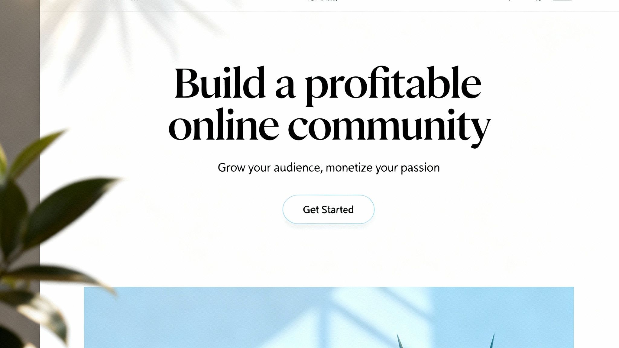
For Zanfia creators, this means shifting from features to benefits. Instead of saying, "Sell online courses," a powerful proposition might be, "Launch a profitable online course and community in one weekend, no tech skills required." This clarity immediately hooks your ideal customer, reduces bounce rates, and sets the stage for conversion by connecting your solution directly to their primary goal. It’s a core component of high-performing pages, and mastering it is a key step in improving your results. To dig deeper into how this impacts conversions, you can find more information about conversion rate optimization strategies on zanfia.com.
How to Craft a Winning Value Proposition
To make your value proposition resonate, focus on these actionable tips:
- Focus on Outcomes: Your audience doesn't want an "integrated membership platform"; they want to "Build a profitable online community under your own brand." Always lead with the end result they desire.
- Use Their Language: Speak directly to your audience of creators, experts, or 'Business Architects'. Use terms and address pain points they instantly recognize, like escaping high transaction fees.
- Quantify When Possible: Add credibility with numbers. "Join 10,000+ creators keeping 100% of their revenue" is far more compelling than a generic statement.
- Test and Iterate: Don't settle for your first idea. Use Zanfia's landing page builder to create 3-5 headline variations and test them to see which one performs best with your target segment.
- Prioritize Mobile Readability: Ensure your headline and sub-headline are large, clear, and immediately readable on a smartphone screen, where a significant portion of your audience will view them first.
2. Single-Focused Call-to-Action (CTA)
Once your value proposition captures a visitor's attention, the next critical step is to guide them toward a single, clear action. This is where a dominant, focused Call-to-Action (CTA) becomes one of the most vital landing page optimization best practices. A cluttered page with multiple competing CTAs creates decision paralysis, causing confusion and abandonment. The goal is to eliminate all distractions and make the next step obvious, frictionless, and compelling.
For Zanfia creators, this means every landing page should have one primary job, whether it's selling a course, registering for a webinar, or joining a community. A single, high-contrast button like "Launch My Course" or "Join My Community" channels all of the page's momentum into one conversion goal. This singular focus is a cornerstone of an effective sales funnel, simplifying the user journey and dramatically increasing the likelihood of conversion. You can discover more about how CTAs fit into the broader customer journey by exploring how to create a sales funnel on zanfia.com.
How to Design a High-Converting CTA
To make your CTA impossible to ignore and easy to click, implement these actionable strategies:
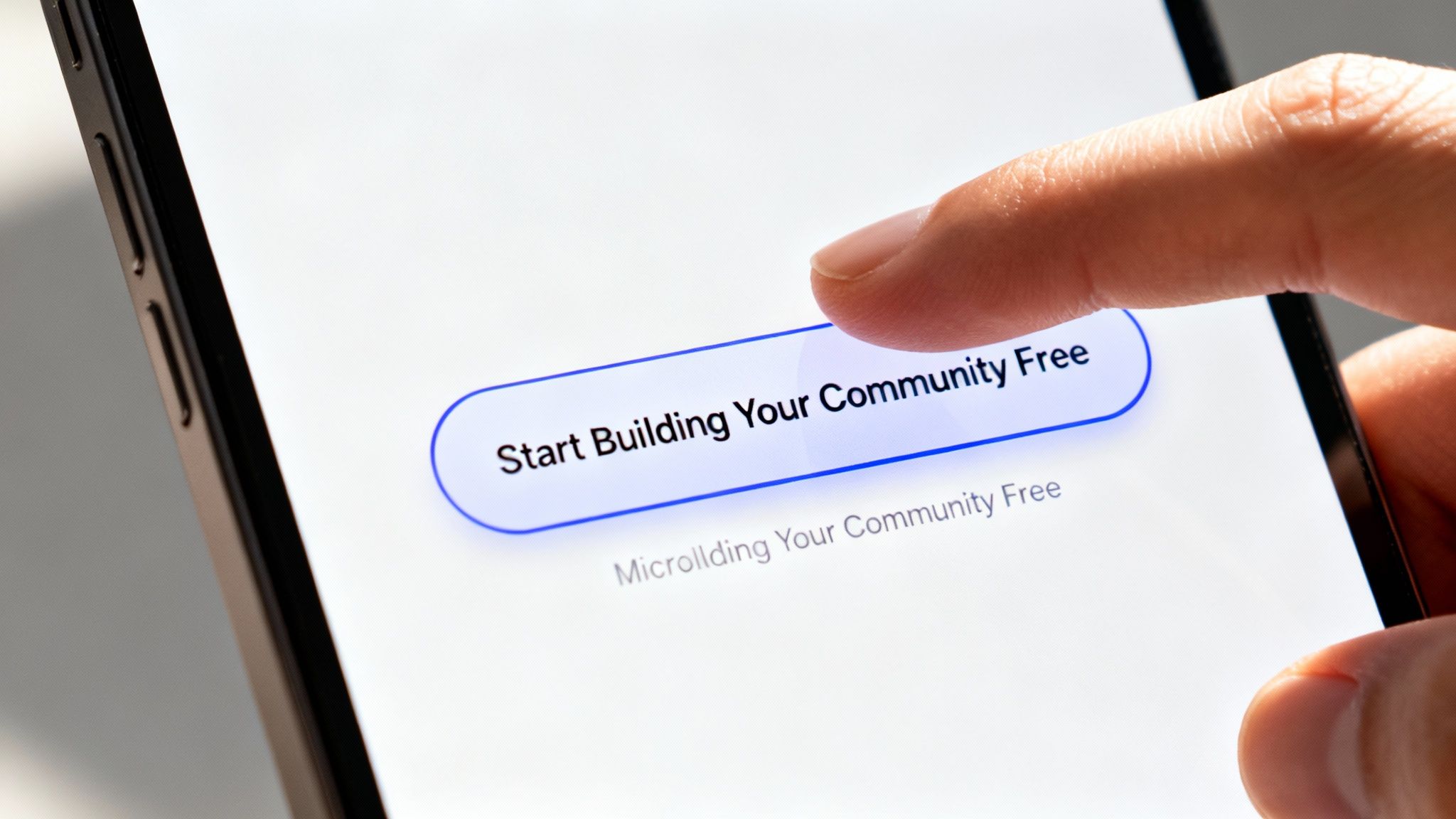
- Use Action-Oriented Verbs: Start your CTA with a strong verb that commands action. Instead of a passive word like "Submit," use powerful phrases like "Start My Free Trial" or "Build My Profitable Community."
- Emphasize the Benefit: Tie the action directly to the value the user will receive. "Start Selling with 0% Fees" is far more persuasive than a generic "Click Here" because it reinforces a key differentiator.
- Create Visual Contrast: Your primary CTA button should pop off the page. Use a color that contrasts sharply with your page's background but still aligns with your brand. A/B testing different colors can often yield a 15-25% improvement in clicks.
- Prioritize Placement: Place your main CTA prominently above the fold so it’s visible immediately. For longer pages, strategically repeat the CTA or use a sticky header so the option to convert is always accessible as users scroll.
- Optimize for Speed and Value: For Zanfia creators, emphasizing a quick start can be highly effective. A CTA like "Launch in 5 Minutes" addresses the common pain point of tech overwhelm for 'Potential Explorers' and highlights the platform's efficiency.
3. Mobile-First Responsive Design
In today's digital landscape, assuming your audience is on a desktop is a critical mistake. With a significant portion of web traffic originating from smartphones, one of the most vital landing page optimization best practices is adopting a mobile-first design philosophy. This means you design the experience for the smallest screen first and then adapt it for larger devices, not the other way around. It ensures your core message, call to action, and user journey are perfectly streamlined for on-the-go users.
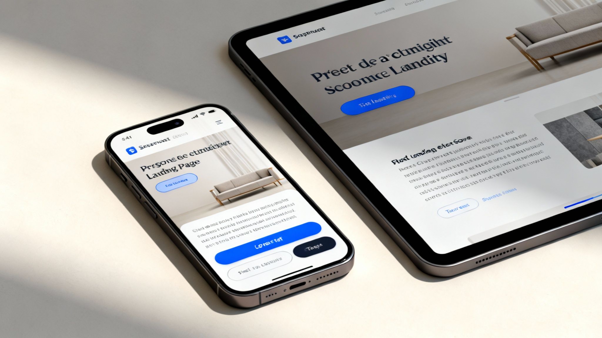
For Zanfia creators, whose audiences often discover courses or communities through social media on their phones, a clunky mobile experience is a conversion killer. Pages that are difficult to navigate, read, or interact with on a small screen lead to immediate frustration and high bounce rates. A responsive page, like those built with Zanfia's editor, dynamically adjusts all elements, from text size to button placement, ensuring a seamless experience that builds trust and guides visitors smoothly toward conversion, regardless of their device. This isn't just a technical detail; it's a fundamental aspect of meeting your audience where they are.
How to Implement a Mobile-First Approach
To ensure your landing page converts effectively on all devices, focus on these actionable tips:
- Prioritize Content Hierarchy: On a mobile screen, space is limited. Decide what is most important for a user to see first (your value proposition and CTA) and ensure it's visible without excessive scrolling.
- Optimize for Touch: Make sure buttons and links are large enough to be easily tapped with a thumb without accidentally hitting other elements. A common guideline is a target size of at least 44×44 pixels.
- Streamline Your Forms: Mobile users have little patience for long, complex forms. Reduce the number of required fields to the absolute minimum. Zanfia's checkout is optimized for mobile, supporting quick payments via Apple Pay, Google Pay, and BLIK.
- Compress and Format Images: Large image files are a primary cause of slow load times on mobile. Use modern formats like WebP and compress images to find the right balance between quality and file size. Zanfia handles this optimization automatically to improve performance.
- Test on Real Devices: While browser emulators are useful, nothing beats testing your page on actual smartphones and tablets. This helps you catch issues with layout, font rendering, and interactivity that emulators might miss.
4. Social Proof and Trust Signals
When a visitor lands on your page, one question silently dominates their thoughts: "Can I trust this?" Answering this is a critical part of landing page optimization best practices. Social proof and trust signals work by demonstrating that other people, just like them, have already trusted you and achieved positive results. This psychological principle dramatically reduces hesitation, builds credibility, and makes your offer feel like a safe, proven choice.
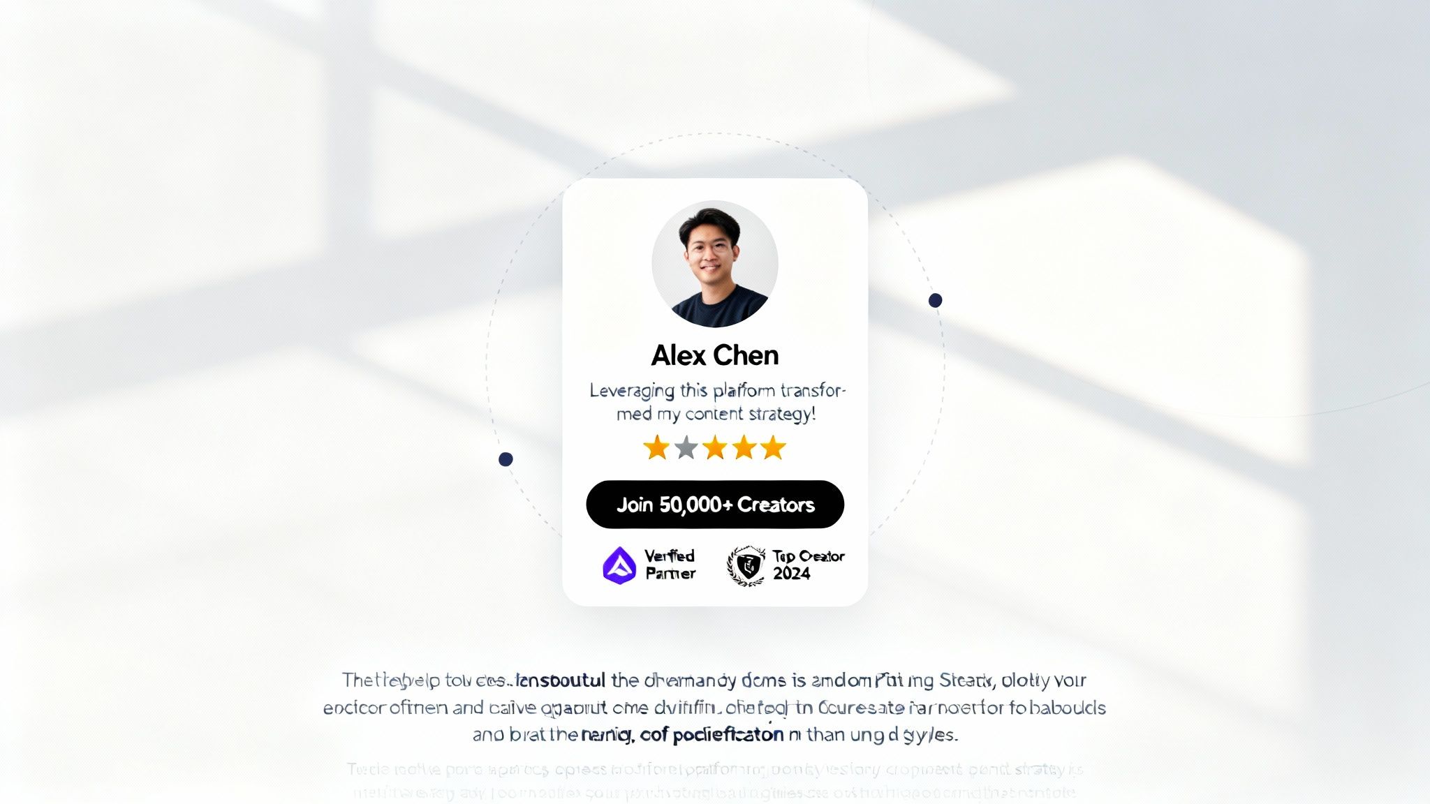
For Zanfia creators, this isn't just about adding a few quotes; it's about showcasing a thriving community of successful entrepreneurs. By strategically placing testimonials from respected Polish creators, you shift the narrative from a simple sales pitch to a validated solution. Hearing serial entrepreneur Artur Kurasiński call Zanfia “the most convenient and simplest solution” builds instant credibility, making your value proposition instantly more believable and compelling. If you need help gathering these powerful assets, you can discover more about how to get testimonials from customers on zanfia.com.
How to Build Trust with Social Proof
To effectively integrate social proof and boost conversions, focus on these actionable tips:
- Feature Relatable Testimonials: Showcase reviews from creators in your target audience. A testimonial from a fellow course creator like Przemysław Niemczuk praising the “simplicity and high functionality” will resonate far more than a generic one.
- Highlight Specific Results: Vague praise is forgettable. Use quotes that quantify success, such as "Without Zanfia, developing a paid newsletter and community in Poland would be much harder—it’s the best tool in the market" from Wojciech Pisarski.
- Leverage Video for Engagement: A heartfelt video testimonial can be significantly more persuasive than text. Use Zanfia’s landing page builder to easily embed short, impactful video reviews from your most successful members.
- Display Trust Badges: Add credibility by showing logos of integrated payment gateways like Stripe, PayU, Przelewy24, and BLIK. This signals security and familiarity to Polish customers.
- Create a 'Featured Creators' Section: Dedicate a space on your page to spotlight your top-performing members. This not only validates your platform but also provides an aspirational goal for new visitors.
5. Strategic Lead Magnet Offers
A high-converting landing page doesn't just sell; it builds a long-term asset: your audience. This is where one of the most effective landing page optimization best practices enters the picture: the strategic lead magnet. A lead magnet is a valuable, free resource you offer in exchange for a visitor's email address. This simple transaction turns passive traffic into a qualified list of potential customers you can nurture, making it a cornerstone of sustainable business growth on Zanfia.
Instead of hoping visitors buy on their first visit, a lead magnet initiates a relationship. For Zanfia creators, this could be a checklist, an e-book, a mini-course, or a webinar. By providing immediate value, you establish expertise and trust, moving prospects from "just browsing" to "actively engaged." This tactic is crucial for building the foundation for future sales of your courses, community memberships, and digital products, ensuring your marketing efforts have a lasting impact beyond a single page view.
How to Create a High-Converting Lead Magnet
To make your lead magnet an irresistible offer, focus on these actionable tips:
- Solve a Specific Problem: Don't offer a generic "e-book on marketing." Provide a tangible solution like a "Community Building Blueprint" for 'Business Architects' or a "First Digital Product Launch Checklist" for 'Potential Explorers'.
- Promise a Quick Win: Your audience wants immediate results. A "Membership Revenue Calculator" or a "5-Minute Video Script Template" is more appealing than a dense, 100-page guide because it offers a fast, tangible benefit.
- Align with Your Core Offer: Ensure your lead magnet is a natural prequel to your paid product. If you sell a comprehensive course on building a community, a free guide on the topic qualifies the perfect audience for your main offer.
- Optimize for Instant Access: Gate your lead magnet behind a simple form on your Zanfia landing page. Use Zanfia's powerful automations to deliver the resource instantly via email and trigger a welcome sequence, reinforcing your brand's reliability and efficiency.
- Test Different Formats: Don't assume a PDF is always best. Experiment with video guides, templates, or exclusive access to a "taster" lesson within your Zanfia course environment to see what resonates most with your audience. You can find more inspiration by exploring how to create powerful lead magnets on zanfia.com.
6. Benefit-Focused Feature Breakdown
Your visitors don't care about a long list of technical features; they care about what those features can do for them. One of the most impactful landing page optimization best practices is to shift from a feature-first to a benefit-first presentation. Instead of simply listing what your product does, you must translate each feature into a tangible outcome that solves a specific problem or helps your audience achieve a desired goal.
For Zanfia creators, this means connecting platform capabilities directly to their business aspirations. Listing "native video hosting" is technical. Framing it as "Launch professional courses without expensive video tools, saving you hundreds of dollars a month," immediately communicates value. This approach helps non-technical creators see your product not as complex software, but as a direct solution to their biggest challenges, significantly boosting comprehension and conversion rates.
How to Reframe Features as Benefits
To turn your feature list into a powerful sales tool, apply these actionable tips:
- Create Feature-Benefit Pairs: For every feature, ask "so what?" and write down the answer. For example, Zanfia’s "Integrated Community" isn't just a feature; its benefit is you "Keep your audience engaged in one place, boosting retention and lifetime value, without sending them to external groups."
- Focus on Time and Money: Quantify the value whenever possible. A feature like "Powerful automations" becomes far more compelling when framed as the ability to "Save 5–10+ hours a month on admin chores and never miss a welcome email again."
- Use Visuals and Icons: Pair each benefit with a simple, clean icon. This breaks up the text, makes the page scannable, and helps visitors quickly grasp the value of each component without having to read every word.
- Group by User Goal: Organize your feature-benefit sections around the user's journey. Create groups like "Build Your Community," "Sell Your Products," and "Automate Your Business" to help visitors find the solutions most relevant to their immediate needs.
- Address Creator Pain Points: Speak directly to the frustrations of your audience. Frame a benefit around avoiding complexity, hidden costs, or brand dilution, such as "Keep 100% of your revenue with our 0% platform transaction fees and build your brand on your own domain."
7. Strategic Use of Video and Visual Content
In a world of short attention spans, text alone often isn’t enough to capture and hold a visitor's interest. This is where another crucial landing page optimization best practices comes in: using high-impact video and visual content. A well-placed video can communicate your value proposition more quickly and emotionally than paragraphs of text, significantly boosting engagement and time on page. For Zanfia creators, this means showing, not just telling, the transformation your course or community offers.
Instead of describing how your course works, a short video demo can walk visitors through a key module. Rather than listing community features, a clip can showcase the vibrant interactions happening inside. Zanfia’s smart video player, which natively hosts content and saves student progress, makes this seamless. Showing a preview of this professional experience can significantly increase a visitor's confidence and desire to enroll.
How to Leverage Visuals for Higher Conversions
To make your visual content a conversion driver, focus on these actionable tips:
- Keep Hero Videos Concise: Aim for 60-90 seconds for any video placed above the fold. This length is ideal for mobile viewers and communicates your core message before they lose interest.
- Show the "Before and After": Create visuals that contrast the struggle of managing a business with scattered tools versus the streamlined success of an all-in-one platform. This clearly demonstrates the value of your solution.
- Demonstrate the User Experience: Use Zanfia's native video hosting to create screen recordings that showcase the actual process of creating a course, engaging in your community, or accessing content. This demystifies the experience and builds confidence.
- Add Captions to All Videos: A staggering 85% of social media videos are watched with the sound off. Adding clear, legible captions ensures your message gets across, regardless of how your audience is viewing.
- Optimize for Performance: High-quality visuals shouldn't slow your page down. Zanfia's native video hosting is optimized for performance, but ensure your images are also compressed and lazy-loaded so media only loads as a visitor scrolls.
8. Minimal Form Fields and Friction Reduction
Every field you ask a visitor to fill out is a potential point of friction and a reason for them to abandon your page. A core tenet of landing page optimization best practices is to make the conversion process as seamless as possible by minimizing form fields. The goal is to ask for only the absolute essential information needed to complete the primary action, whether it's signing up for a newsletter, starting a trial, or making a purchase. The less work you make for your visitors, the higher your completion rates will be.
For Zanfia creators, this means challenging the impulse to gather extensive data upfront. Instead of a long form, a high-converting checkout might only ask for an email and payment details, especially with built-in invoicing integrations that handle the rest. Zanfia’s system automatically generates and sends invoices via inFakt or Fakturownia, simplifying compliance without complicating the purchase experience. This dramatically lowers the barrier to entry, getting more customers to complete their purchase.
How to Reduce Form Friction
To streamline your forms and increase conversions, implement these actionable strategies:
- Start with the Essentials: For most initial signups (like a newsletter or free trial), all you truly need is an email address. You can ask for a name and other details in a follow-up email sequence or onboarding process.
- Leverage One-Click Payments: Offer popular Polish and global payment options like Stripe, PayU, Przelewy24, and BLIK. Supporting Apple Pay and Google Pay through Zanfia’s cart further removes the need for manual typing.
- Automate Post-Purchase Steps: Don't ask for invoicing details at checkout. Use Zanfia’s integration with inFakt and Fakturownia to automatically generate invoices after the sale, keeping the buying process clean and fast.
- Incorporate Reassuring Micro-copy: Reduce anxiety around the submit button with clear, reassuring text. Phrases like "Secure Payment," "Instant Access," or "0% Platform Fees" can make a significant psychological difference.
- Test a Single-Field Form: Using Zanfia's landing page builder, A/B test a traditional form against one that only asks for an email for lead magnets. You might be surprised by how much this single change can lift your capture rates.
9. Clear Pricing and Transparent Value Tiers
One of the biggest sources of friction on any landing page is pricing uncertainty. A crucial element of landing page optimization best practices is presenting your pricing with absolute clarity, ensuring potential customers can quickly understand what they get at each level. Hesitation kills conversions, and a confusing pricing page is a primary cause of visitor drop-off right before the final decision. This isn't just about listing prices; it's about transparently justifying the value delivered in each tier.
For Zanfia creators, this means going beyond simple price tags. Zanfia’s flexible monetization options allow you to sell products as one-time purchases, subscriptions, installment plans, or bundles. Use a comparative table to clearly differentiate these offers. Show the tangible benefits a customer unlocks with each option, such as lifetime access for a one-time fee versus ongoing support in a subscription. This helps users self-select the best plan for their needs and budget, making the decision to purchase feel informed and confident.
How to Implement Transparent Pricing
To build a high-converting pricing section, apply these actionable tips:
- Quantify Tier Limits: Be specific. Instead of "Basic Plan," frame it as "Launch Your First Course (Up to 250 Students)." This helps users visualize the scale and choose the right starting point.
- Highlight the "Most Popular" Plan: Use a visual cue like a border or a badge to guide visitors toward the plan that offers the best value. This is typically the mid-tier option and simplifies the decision-making process for most buyers.
- Emphasize Your Differentiator: If you're on Zanfia, make the 0% transaction fee a central part of your pricing message. Show visitors they're not losing a percentage of their hard-earned revenue with every sale.
- Offer Flexible Payment Options: Clearly display choices like one-time payments, subscriptions, or installment plans. This flexibility can capture customers with different budget constraints, increasing overall conversions.
- Keep It Simple: Avoid overwhelming visitors with too many options. Three to four well-defined tiers are usually sufficient to cater to different segments without causing analysis paralysis. Learn more about effective pricing models by exploring these subscription pricing strategies on zanfia.com.
10. Strategic Page Scrolling and Content Sequencing
A landing page isn't just a collection of information; it's a carefully choreographed conversation. This is where one of the most powerful landing page optimization best practices comes into play: strategic content sequencing. Instead of simply listing features, you must guide your visitor on a psychological journey, organizing content in a logical flow that builds trust, addresses objections, and leads them directly to the "buy" button.
For a Zanfia creator, this means thinking like a storyteller. You start with the promise (the value proposition), introduce the problem your audience faces (like juggling disjointed tools), present your course or community as the solution, and then back it up with social proof from other Polish creators. This intentional flow keeps visitors engaged as they scroll, anticipating their questions at each stage and providing the right answers. By controlling the narrative, you transform a passive reader into an engaged prospect, dramatically increasing their likelihood of conversion.
How to Sequence Your Landing Page for Maximum Impact
To create a persuasive content flow, follow these actionable tips:
- Structure a Persuasive Narrative: Follow a proven formula like Problem-Agitate-Solution (PAS). Start by highlighting the pain of juggling multiple tools and paying high fees, then introduce your all-in-one offering on Zanfia as the elegant, cost-effective solution.
- Pace the Content with Visuals: Use high-quality images, whitespace, and section dividers within the Zanfia page builder to create visual breaks. This prevents reader fatigue and makes the journey down the page feel effortless and engaging.
- Place Social Proof Strategically: Insert your strongest testimonials or case studies right before a major decision point, such as the pricing section. This builds confidence and helps overcome last-minute hesitation.
- Use Scroll-Tracking to Find Drop-Offs: Use analytics tools to see where visitors stop scrolling. If a large percentage leaves at a certain point, that section needs to be re-evaluated for clarity, relevance, or persuasiveness.
- Test Different Sequences: Don't assume your first layout is the best. You can A/B test different content orders to see what resonates most with your audience. Understanding the difference between testing methodologies is crucial for effective iteration. You can learn more about Multivariate Testing vs. A/B Testing to choose the right strategy for your experiments.
Top 10 Landing Page Optimization Practices Comparison
| Element | Implementation Complexity 🔄 | Resources Required ⚡ | Expected Outcomes ⭐📊 | Ideal Use Cases 💡 | Key Advantages ⭐ |
|---|---|---|---|---|---|
| Clear Value Proposition Above the Fold | Low–Medium — copy + design, needs A/B testing | ⚡ Low — copywriter, designer, minor dev | Reduces bounce 20–30%; increases time on page; faster user understanding | New visitors; homepage/hero; creators unfamiliar with platform | Immediate clarity; establishes credibility; boosts initial conversions |
| Single-Focused Call-to-Action (CTA) | Low — design, placement, consistent copy | ⚡ Low — design, analytics, small dev changes | Increases conversions 30–50%; reduces decision paralysis; clearer attribution | Signup/trial pages; high-intent landing pages; mobile CTA-heavy flows | Simplifies journey; improves mobile UX; easier tracking |
| Mobile-First Responsive Design | High — cross-device layouts, performance tuning | ⚡ High — front-end dev, QA, optimized assets | Improves mobile conversions; reduces mobile bounce up to 40%; SEO boost | Mobile-dominant audiences; global traffic; creators on phones/tablets | Consistent UX across devices; better SEO; future-proofed pages |
| Social Proof and Trust Signals | Medium — collect testimonials, design placement | ⚡ Moderate — customer outreach, content/design work | Increases conversions 20–50%; lowers perceived risk; builds authority | New visitors evaluating trust; price-sensitive segments; competitive markets | Builds credibility; emotional connection; supports pricing decisions |
| Strategic Lead Magnet Offers | Medium — create valuable content + nurture flows | ⚡ Moderate — content creator, email automation, landing pages | Grows email list 50–200%; generates qualified leads for nurture | Top-of-funnel capture; audience building; webinar/guide promotion | Rapid list growth; enables segmentation; fuels email sequences |
| Benefit-Focused Feature Breakdown | Medium — map features to outcomes, visual design | ⚡ Moderate — product PM, UX, copy, icons/design | Improves comprehension; increases engagement; reduces support questions | Non-technical users; feature-rich products; purchase deliberation | Communicates outcomes not specs; aligns to user goals; aids decision-making |
| Strategic Use of Video and Visual Content | High — production, hosting, optimization | ⚡ High — video production, editing, hosting bandwidth | Boosts conversions 20–80%; +2–3 min on-page; better message retention | Complex workflows, demos, storytelling, social promotion | Demonstrates product flow; higher engagement; SEO and social lift |
| Minimal Form Fields & Friction Reduction | Medium — UX changes, progressive profiling infra | ⚡ Low–Moderate — dev, analytics, auth integrations | Single-step forms convert 25–50% higher; each extra field −3–5% conv | Trial signups, checkout, mobile onboarding | Faster onboarding; lower abandonment; better completion rates |
| Clear Pricing & Transparent Value Tiers | Medium — pricing strategy, comparison tables | ⚡ Moderate — product/finance input, design, copy | Reduces objections; increases AOV through proper tiering; self-selection | SaaS subscription pages; tiered product offerings; enterprise vs SMB | Clarifies choices; supports segmentation; builds trust |
| Strategic Page Scrolling & Content Sequencing | Medium–High — content strategy, UX, iterative testing | ⚡ Moderate — copywriters, UX designers, analytics tools | Improves conversions 20–40%; maintains engagement through funnel | Long-form landing pages; complex solutions; storytelling funnels | Guides decision journey; addresses objections at right time; improves persuasion |
Your Blueprint for Sustainable Growth
We've journeyed through ten foundational pillars of high-converting landing pages, from crafting a magnetic value proposition to sequencing content for maximum impact. Each principle, whether it's simplifying your forms or showcasing powerful social proof, is a vital component in a much larger machine: your sustainable growth engine. Mastering these landing page optimization best practices is not a one-time task but an ongoing commitment to understanding and serving your audience better. It's the critical bridge between creating valuable content and building a thriving, profitable business.
The real power of these strategies is unlocked when they are applied in unison. A brilliant CTA is ineffective on a slow-loading page. Compelling social proof loses its impact if buried below the fold on a mobile device. Your goal is to create a cohesive, frictionless experience where every element works in harmony to guide your visitor toward a single, clear objective. This systematic approach transforms your marketing from a game of chance into a predictable system for attracting your ideal customers and converting their interest into action.
From Theory to Tangible Results
The difference between a landing page that "looks good" and one that consistently generates leads and sales lies in the deliberate application of these proven principles. Think of this guide as your strategic blueprint. Your next steps shouldn't be to overhaul everything at once, as this can be overwhelming. Instead, adopt an iterative mindset:
- Audit Your Current Pages: Start by evaluating one of your key landing pages against the ten practices discussed. Where are the most significant gaps? Is your CTA singular and compelling? Are your trust signals prominent?
- Prioritize for Impact: Identify the "low-hanging fruit." Perhaps adding a testimonial block or simplifying your form fields is a quick change that could yield immediate results. Improving your page speed or mobile layout are often high-impact starting points.
- Test and Measure: Implement one or two changes and then rigorously track the results. Use the analytics built into your platform to monitor conversion rates, bounce rates, and user engagement. A/B testing is your most reliable ally in this process, providing clear data on what truly resonates with your audience.
This continuous cycle of implementation, testing, and refinement is the core discipline behind successful landing page optimization best practices. It’s about making small, incremental improvements that compound over time, leading to significant gains in revenue and customer acquisition.
The Foundation for Your Creative Vision
Ultimately, an optimized landing page is the stage upon which your products, courses, and community shine. It gives your expertise the professional presentation it deserves, building the trust necessary for a visitor to become a paying customer. When your landing pages are working for you around the clock, they automate the most difficult parts of marketing, freeing you to focus on what you are truly passionate about: creating exceptional content, engaging with your community, and innovating within your niche. By mastering this critical skill set, you are not just building better webpages; you are building a more resilient, profitable, and impactful digital business.
Ready to implement these best practices on a platform built for creator success? Zanfia provides all the tools you need to build high-converting landing pages, backed by a powerful all-in-one system for courses, communities, and digital products, all with 0% platform transaction fees. Start building your frictionless customer journey today at Zanfia and keep 100% of your revenue.