

Create a Landing Page with WordPress: The 2026 Guide

You've got the offer. Maybe it's a course, a paid newsletter, a consulting package, an ebook, or a private community. What you don't have yet is a page that turns interest into action.
That's usually where the friction starts. WordPress looks like the obvious answer because it's familiar, flexible, and endlessly extendable. But a landing page with wordpress can either become a focused conversion asset or a small engineering project disguised as a marketing task.
The difference comes down to decisions most creators make too late. Which builder you choose. How much design freedom you need. Whether your checkout, email flow, access control, and analytics work together or fight each other. A landing page is simple on the surface. The stack behind it often isn't.
Table of Contents
Why a WordPress Landing Page is Your Digital Handshake
A landing page isn't just another page on your site. It's the page that takes one traffic source, one audience, and one offer, then gives that visitor one clear next step.
That matters because homepages try to do too much. They introduce the brand, explain the business, link to blog posts, route different audience types, and support general browsing. A landing page should do the opposite. It should remove choice, narrow attention, and push one conversion goal.
One page, one goal
When I review underperforming pages, the problem usually isn't the design first. It's divided intent. The page asks the visitor to subscribe, browse, learn more, follow on social, and maybe buy later. That's not a landing page. That's a navigation hub.
A stronger setup looks like this:
- Lead magnet page with one email signup CTA
- Course sales page with one purchase CTA
- Webinar registration page with one registration CTA
- Community waitlist page with one join CTA
Practical rule: If the visitor can do five things, many of them will do nothing.
This focus is one reason landing pages continue to outperform broader site pages. According to 2026 landing page statistics from SellersCommerce, dedicated landing pages convert 160% better than other signup methods, and businesses with over 40 landing pages generate over 500% more leads than those with fewer than 10.
That second number matters more than many creators realize. Better results don't always come from endlessly tweaking one page. Often they come from building separate pages for separate intents.
Why WordPress is usually the default
WordPress remains the obvious starting point because it's familiar and widely supported. If you already run your site on it, building a landing page there feels efficient. You keep your domain, your theme, your content, and your existing plugins in one place.
For a basic foundation, this WordPress landing page design guide is a useful reference because it walks through the mechanics without overcomplicating the setup. If you're still shaping the basics of page intent and page structure, it also helps to review what a landing page is.
WordPress gives you control. That's its strength.
It's also where the trade-off begins. The same flexibility that makes WordPress attractive can introduce builder conflicts, plugin overlap, slower pages, and more maintenance than a single-offer funnel really needs.
Choosing Your WordPress Building Blocks
WordPress powers 43.5% of all websites, and its ecosystem includes over 59,000 free plugins, which is a big reason so many creators use it for landing pages in the first place, as noted in Hostinger's WordPress statistics roundup. The upside is choice. The downside is that beginners often confuse more choice with a better outcome.
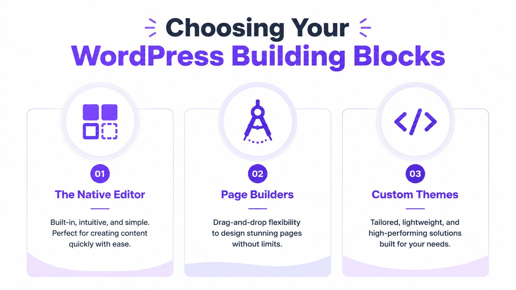
The three paths frequently considered are the native Block Editor, a page builder plugin, or a more custom lightweight theme setup. Each can work. Each also creates a different maintenance burden.
The native editor
Gutenberg is better than many marketers give it credit for. If your page is structurally simple, hero section, benefits, proof, CTA, FAQ, and footer, the Block Editor is often enough.
Its main advantage is restraint. You're less likely to create an overdesigned page that loads poorly or becomes hard to edit later. It also keeps you closer to WordPress core behavior, which usually means fewer compatibility issues.
The weak point is layout precision. If you want pixel-level design control, advanced animations, or a highly stylized page, you may feel constrained.
Page builders
Elementor, Beaver Builder, and similar tools give non-developers a lot more control. For marketers, that can be useful. You can launch faster, test layouts visually, and hand the page to a client or team member who doesn't code.
But that convenience comes with baggage. A page builder can add extra CSS, scripts, and editor complexity. Some teams keep adding widgets because the interface makes it easy, then wonder why the page feels heavy and conversion drops.
The best page builder is the one that lets you publish fast without turning every update into a design exercise.
Custom lightweight themes
A lean setup built on a lightweight theme can be the cleanest route if performance matters and you're comfortable making tighter design decisions up front. This path usually suits agencies, experienced marketers, and operators who care more about speed and stability than visual experimentation.
It's rarely the fastest way to build your first page. It's often one of the best ways to avoid future bloat.
WordPress landing page builder comparison
| Method | Best For | Cost | Performance Impact | Learning Curve |
|---|---|---|---|---|
| Native Editor | Simple campaigns, solo creators, content-first pages | Usually low | Usually lighter | Low |
| Page Builders | Non-technical users who want visual control | Varies by plugin and add-ons | Can be heavier | Medium |
| Custom Themes | Performance-focused teams and experienced builders | Varies by setup and development time | Often lighter if built well | Higher |
A practical decision filter helps:
- Choose the Block Editor if your offer is simple and you want the fewest moving parts.
- Choose a page builder if speed of design iteration matters more than absolute cleanliness.
- Choose a lean custom setup if you know performance and long-term maintainability will matter more than visual freedom.
If the page is part of a broader revenue system, not just a lead capture page, compare your build path against the tools you'll need later for checkout, delivery, and customer management. That's where many WordPress setups stop being simple. A broader view of that stack appears in this guide to best platforms to sell digital products.
Designing for Conversions Not Just Compliments
A page can look polished and still fail. That happens when the design serves the brand mood more than the buying decision.
The best landing page with wordpress usually isn't the one with the most effects. It's the one that makes the next step feel obvious. Clear offer. Clear benefit. Clear CTA. Minimal friction.

Build the page in decision order
Visitors don't read pages the way creators build them. They scan for relevance first, then proof, then effort, then risk.
That means your page should answer these questions in order:
- What is this?
- Is it for me?
- Why should I trust it?
- What do I do next?
If your hero section can't answer the first two questions quickly, the rest of the page often won't matter. Weak headlines are still one of the biggest conversion killers I see.
A strong hero section usually includes:
- A direct headline that names the outcome or offer
- A supporting line that explains who it's for and why it matters
- One primary CTA that matches the buyer's stage
- A visual that supports comprehension, not decoration
Minimalism works because clarity works
A lot of creators hear “minimalist layout” and think it means bland. It doesn't. It means removing anything that competes with the conversion goal.
According to Start Designs' WordPress expert guidance, practitioners recommend a minimalist layout and First Contentful Paint under 1.5 seconds. Their cited study found that pages hitting that threshold saw 15–25% higher conversions than pages with FCP above 3 seconds.
That has direct design implications:
- Use fewer sections unless the offer needs more explanation
- Keep one dominant CTA instead of splitting attention
- Cut decorative widgets that delay loading
- Place proof near moments of hesitation, not in a testimonial graveyard at the bottom
Good landing page design feels easy to use because the page made hard decisions before the visitor arrived.
For a solid outside reference on optimizing landing pages for conversion, this breakdown from UFO Performance Marketing is worth reviewing. It aligns with what tends to work in practice: hierarchy, focus, and reduced friction.
What usually hurts conversions
Some mistakes are visual. Most are strategic.
- Too many offers confuse traffic from a single campaign.
- Feature-heavy copy explains the product but doesn't sell the outcome.
- Buried CTA buttons force the visitor to hunt for the next step.
- Generic proof feels interchangeable and doesn't reduce risk.
If you're refining copy and structure, this guide to landing page optimization best practices is a useful companion. The main principle is simple. Every section should earn its place by reducing doubt or increasing desire.
Connecting Your Funnel From Payments to Memberships
A landing page can look polished and still break the moment someone clicks the button.
That happens a lot on WordPress. The page itself is rarely the problem. The friction shows up in the handoff between form, checkout, email, access, and follow-up. I've seen pages convert well at the top of the funnel, then lose revenue because a tag failed to fire, a payment confirmation did not trigger access, or a plugin update changed the checkout flow without warning.
Where WordPress stacks get fragile
WordPress handles a basic lead capture flow well enough. Selling paid access is a different build.
A typical funnel often requires several systems to stay in sync:
- Opt-in capture through a form tool
- Checkout through a payment plugin or cart system
- Access control for a course, membership, or newsletter
- Email automation for onboarding and retention
- Tagging or segmentation based on purchase behavior
- Analytics across visits, checkout starts, and completed sales
At that point, the work shifts from page design to system design.
Actual cost shows up after launch. Plugins update on different schedules. Payment tools pass data differently than email tools. Membership plugins have their own logic for roles, access rules, and login states. When those pieces drift out of sync, the result is support tickets, refund requests, and manual fixes that eat into margin.
If organic traffic also matters, the IMADO guide to WordPress landing page performance is a useful companion because speed, plugin weight, and page structure affect more than rankings. They affect the buying experience too.
Community and membership are where the cracks widen
A lot of landing page advice stops at the conversion event. That misses the harder part for creators selling courses, memberships, paid newsletters, or community access.
The page has to do more than persuade. It has to set up the post-purchase experience clearly enough that buyers know what happens next, where they get access, and why the offer feels active rather than static.
That changes the way I'd structure the funnel:
- Show what the buyer enters after payment, not only what they receive
- Place proof around participation, such as member activity, outcomes, or onboarding clarity
- Tie the CTA to access, so the action feels connected to the result
- Reduce the gap between payment and first win, especially for memberships and courses
If you're refining the action step itself, this article on how add to cart button choices affect conversion flow is worth reading. Small CTA decisions often create bigger funnel problems downstream.
A useful product walkthrough appears below.
When an all-in-one setup makes more sense
For a creator selling a single freebie or collecting email leads, WordPress can be enough.
For a business selling digital products, subscriptions, courses, and community access together, the stack gets harder to justify. A platform approach becomes practical at this stage. Fewer moving parts usually means fewer handoff failures, cleaner reporting, and less time spent debugging plugin conflicts.
Zanfia combines landing pages, checkout, community, courses, subscriptions, automations, analytics, and custom domain support in one system. That matters because the funnel is managed as one connected experience instead of several tools patched together. Access can be granted after payment, onboarding emails can trigger automatically, and buyer actions can update the right records without extra middleware.
WordPress is still a valid choice. It just stops being the efficient choice once the page becomes the front end of a paid ecosystem. When revenue depends on what happens after the click, integration quality matters as much as the page itself.
Tracking Success and Optimizing for Growth
Launching the page isn't the win. Knowing why it performs is.
Many creators publish a landing page, watch sales or signups come in slowly, then start changing random things. New headline. Different button color. Another testimonial. That usually creates noise, not insight. You need a measurement plan first.

Track the handoff points
For WordPress landing pages, I care most about where the visitor drops out. Not just how many people land.
Start with a short list:
- Traffic source quality tells you whether the problem is targeting or page experience.
- Landing page conversion rate shows whether the message and offer are aligned.
- Bounce behavior often points to relevance, speed, or mobile friction.
- Checkout completion matters if the CTA sends people into a separate cart flow.
WordPress supports this through analytics plugins and external tracking tools, but the burden is on you to connect the dots. That's the hidden cost. Data often exists, but not in one clean view.
Mobile deserves its own review
A page that feels fine on desktop can still underperform where buyers act. According to this video covering mobile-first optimization gaps, 72% of digital product purchases occur on mobile, and changes such as lazy-loading community feeds or ensuring proper padding can reduce bounce rates by up to 35% in key markets.
That means mobile QA can't be cosmetic. Check:
- Button spacing so taps are easy
- Section padding so content breathes
- Media loading behavior so the page doesn't stall
- Form length so signup doesn't become tedious
A mobile page doesn't need to be shorter. It needs to be easier to continue.
For a broader technical checklist, this IMADO guide to WordPress landing page performance is a helpful companion. If you want to tighten your measurement process, this article on how to analyze website traffic is a practical place to start.
Test one meaningful variable at a time
A/B testing still matters, but only if the variation is tied to a real hypothesis. Test the headline when message match is weak. Test the CTA label when intent is unclear. Test page length when visitors engage but don't act.
Don't test everything at once. You won't learn anything useful.
Frequently Asked Questions
Is WordPress a good choice for a landing page
Yes, if the landing page is relatively simple and you're comfortable managing the stack. WordPress works well for lead generation pages, webinar registration pages, and focused product pages where the rest of the customer journey doesn't require complex automation.
It becomes less comfortable when your page needs checkout logic, access control, subscription handling, community access, and post-purchase workflows.
What's the biggest mistake people make with a landing page with wordpress
They treat page building as the whole job. It isn't. The page is only one layer.
The bigger issue is usually hidden complexity. A builder plugin, form tool, cart plugin, membership plugin, automation connector, analytics tool, and theme customization can all look manageable in isolation. Together, they create dependency chains that are easy to underestimate.
Should I use a page builder or the Block Editor
Use the Block Editor if your offer is straightforward and you value simplicity. Use a page builder if fast visual iteration matters and you accept the performance and maintenance trade-offs.
If you already know speed and stability matter more than visual freedom, a leaner theme-based setup is often the cleaner long-term choice.
Can WordPress handle selling courses, newsletters, and memberships
It can. The better question is whether you want to manage the integration layer yourself.
WordPress can support those business models, but it usually does so through multiple tools that each own a different part of the customer experience. That can work well for technical teams or operators who like assembling systems. It's less attractive for creators who want fewer moving parts and less admin work.
When should I stop adding plugins and consider a different setup
When plugin coordination starts shaping your business decisions.
That usually shows up in familiar ways. You delay launch because the stack isn't stable. You avoid testing a new offer because access logic is messy. You spend time checking whether payments triggered the right permissions. You work around the system instead of using it.
If your funnel depends on constant tool babysitting, the issue usually isn't the landing page copy.
Is an all-in-one platform always better than WordPress
No. If you're a technical user, already have a clean stack, and only need a focused landing page, WordPress can be a strong fit.
But many creators don't need maximum flexibility. They need dependable execution. If your business sells digital access, subscriptions, courses, or community products, an integrated system often gives you cleaner operations, a more predictable customer journey, and fewer failure points.
What should a creator choose right now
A simple rule helps.
- Choose WordPress if you want control, already run your site there, and your funnel is still relatively light.
- Choose a more integrated platform if your offer includes content delivery, memberships, payments, customer automation, and ongoing access management.
- Choose the simpler route if technical overhead has already delayed your launch once.
The right decision isn't about ideology. It's about operational fit.
If you're building a digital product business and don't want your landing page to depend on a growing chain of plugins, Zanfia is worth a look. It gives creators one branded environment for landing pages, payments, courses, newsletters, community, automations, and analytics, with 0% platform fees and support for a custom domain on every plan.


