

High-Converting Thanks You Page: A Creator’s Guide
You get a sale notification, or a new subscriber comes in, and your funnel does exactly one thing after that. It says “Thanks” and stops.
That’s wasted momentum.
Most creators put serious effort into checkout pages, lead magnets, webinar registration pages, and email follow-up. Then they leave the thanks you page as a dead-end receipt. No guidance. No next step. No segmentation. No community invitation. No useful tracking endpoint.
That’s a mistake, especially if you sell courses, memberships, paid newsletters, downloads, or bundled digital products. The moment after conversion is one of the few points in the customer journey where attention is high, trust is fresh, and the buyer wants confirmation that they made the right move.
A good thank you page closes the loop. A high-converting thank you page opens the next one.
Why Your Thank You Page Is a Hidden Goldmine
A creator sells a course, a lead magnet gets downloaded, or someone joins a newsletter. Then the user lands on a plain page with two lines of text and nowhere useful to go.
That page looks harmless. It isn’t.
The thank you page sits at a rare moment of intent. The visitor has already acted. They didn’t bounce from a cold ad. They didn’t skim your homepage and leave. They raised their hand, paid you, or gave you their email. That changes what they’ll do next.
The economics are too good to ignore
The clearest reason to care is simple. The probability of selling to an existing customer is 60-70%, compared to 5-20% for a new prospect, according to this breakdown of thank you page value.
That’s why the thanks you page isn’t just a courtesy screen. It’s a monetization layer.
If someone just bought your membership, offer the paid newsletter add-on. If they downloaded your free guide, invite them to a workshop, waitlist, or starter offer. If they bought a course, direct them into the right discussion space so the purchase doesn’t sit idle in their inbox.
Practical rule: Don’t treat the thank you page as the end of a transaction. Treat it as the start of onboarding.
What a dead-end page costs you
A weak thank you page creates three losses at once:
- Revenue loss: You miss the easiest moment to present a relevant next offer.
- Engagement loss: Buyers leave before they join your community, consume the product, or take a second action.
- Data loss: You give up a clean checkpoint in the funnel.
For creators building under their own domain, that’s especially frustrating. You work to attract the click, win the trust, and close the sale. Then you send people into a blank corridor.
A lot of the tactical fixes are straightforward. If you want extra examples before rebuilding yours, Orbit AI has a practical guide on how to optimize your thank you page. For broader funnel context, this companion guide on leads and conversions is also useful: https://zanfia.com/blog/a-creators-playbook-for-leads-and-conversions/
The opportunity is bigger than most creators think
The best thank you pages do more than confirm a form submission or purchase. They reduce anxiety, direct attention, and create momentum.
A weak version says, “Thank you. Check your email.”
A strong version says, “You’re in. Here’s what happens next. Here’s where to access the product. Here’s the one thing to do right now while your motivation is high.”
That’s the difference between a page that merely acknowledges conversion and one that compounds it.
The Anatomy of a High-Converting Thank You Page
Most thank you pages fail because they try to do too little, or too much.
Too little means a bare confirmation message. Too much means five offers, three conflicting buttons, and a wall of copy that buries the only action that matters.
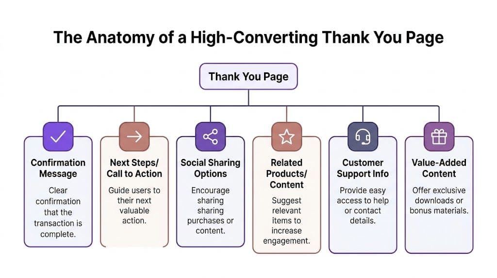
A high-converting thank you page is structured. It confirms the action, reduces uncertainty, and points the user to one logical next move.
Start with confirmation, not cleverness
People want reassurance first.
If someone has just paid, subscribed, or registered, don’t open with brand storytelling or a promotional banner. Open with clear confirmation that the action worked.
That means saying exactly what happened:
- For a freebie: “Your guide is on its way to your inbox.”
- For a webinar: “You’re registered. Check your email for the access link.”
- For a paid course: “Your purchase is complete. You can access your course below.”
- For a membership: “Your membership is active. Start with the welcome area.”
This sounds obvious, but too many pages force users to interpret vague success messages. That creates doubt right after trust was earned.
Tell them what happens next
After confirmation, remove ambiguity.
The page should answer the question a user thinks: “What do I do now?”
That next-step block usually includes:
| Element | What it should do |
|---|---|
| Delivery note | Explain whether access is immediate, sent by email, or both |
| Timing | Tell them when to expect the email or login details |
| Access path | Link directly to the course library, download, community, or dashboard |
| Support fallback | Give a clear path if they don’t receive access |
Many inline success messages fall short. Thank you pages work better because they’re standalone touchpoints. They also support analytics properly. As CXL notes, thank you pages serve as high-engagement touchpoints with a captive audience, and platforms like Google Analytics require a unique thank you page URL to accurately log conversions and track user paths, something inline confirmations often miss: https://cxl.com/blog/thank-you-page/
Choose one primary next action
The page should have one main CTA. One.
Not because secondary links are bad, but because the first click after conversion should be directed. Every digital product business has a version of this choice:
If the product needs activation
Send them to the product.
A buyer who just purchased a course should see “Start lesson one,” not “Follow me on social media.”
If the product benefits from social momentum
Send them into the community.
This works well for memberships, cohorts, accountability groups, and expert subscriptions.
If the user is still early in the relationship
Offer a relevant bridge product.
That might be a starter workshop, a paid newsletter, or a low-friction next step tied closely to the original conversion.
The best next action is the one that increases product consumption fastest. Revenue often follows activation, not the other way around.
Add secondary elements carefully
Once the core path is clear, a thank you page can carry supporting components. These should never overpower the primary CTA.
Useful secondary blocks include:
- Social sharing options: Good after events, waitlists, and community launches.
- Related content: Useful after lead magnet opt-ins when users need more education.
- Customer support details: Important after payment or enrollment.
- Bonus material: Effective when it deepens use of the core purchase.
- Light personalization prompts: Helpful if you want job role, business type, or learning goals.
A lot of creators overplay urgency here. They push hard cross-sells before the buyer even accesses what they bought. That can work in some funnels, but it often hurts trust when the original product is still unconsumed.
Match the page to the conversion type
Not every thank you page should behave the same way.
For reference:
| Conversion type | Best immediate focus |
|---|---|
| Lead magnet opt-in | Delivery confirmation and one small next step |
| Webinar registration | Calendar save, email reminder expectation, bonus prep resource |
| Course purchase | Direct login and start instructions |
| Membership signup | Community entry and onboarding guidance |
| Newsletter subscription | Welcome email expectation and archive or starter content |
| Ebook purchase | Download access and related reading path |
If you need a refresher on how landing pages connect to this part of the funnel, this article is useful: https://zanfia.com/blog/what-is-a-landing-page/
The structure matters because users arrive in different states. A free subscriber still needs conviction. A buyer needs reassurance and activation. A member needs orientation. The page should reflect that.
Crafting Compelling Copy and User-Friendly Design
The mechanics matter, but execution decides whether your thank you page feels clear or sloppy.
I’ve seen creators get the strategy right and still lose momentum because the copy sounds generic, the button is vague, or the mobile layout buries the action below a cluttered screen.
Good thank you pages are short, specific, and easy to act on.
Write like a guide, not a receipt
Your first lines should reduce friction.
Bad copy sounds like software generated it:
- “Submission successful”
- “Your transaction has been processed”
- “Thank you for your order”
That language is accurate, but cold. It doesn’t help the user move.
Better copy is direct and useful:
- “You’re in. Check your inbox for the download link.”
- “Your course access is ready. Start with lesson one below.”
- “Your membership is active. Join the welcome channel first.”
- “You’re registered. Add the session to your calendar now.”
The difference is small on paper and large in practice. The second version confirms the action and gives direction.
Use buttons that describe the reward
CTA labels should answer “what happens when I click?”
Compare these:
| Weak CTA | Better CTA |
|---|---|
| Continue | Access your course |
| Learn more | Join the community |
| Click here | Download your ebook |
| Next step | Save your webinar seat details |
Generic buttons force people to think. Precise buttons reduce hesitation.
Copy shortcut: If the button text could appear on any page of any website, rewrite it.
Keep the layout brutally simple
A thank you page doesn’t need the complexity of a sales page.
In most cases, the visual hierarchy should look like this:
- Confirmation headline
- One-sentence explanation
- Primary CTA
- Optional support or secondary action
- Any bonus or community prompt
That order matters because users scan. They don’t study.
A strong design also keeps branding consistent. Same tone. Same visual language. Same promise. If your checkout feels premium but your thank you page looks like an afterthought, you create doubt right after payment.
For examples of how microcopy shapes first impressions across a site, this related article is useful: https://zanfia.com/blog/welcome-message-for-a-website/
Mobile-first is not optional
Here, many thanks you page designs break.
According to ThriveCart’s thank you page examples, 65% of digital product purchases happen on mobile, and making CTAs thumb-friendly while placing them above the fold can significantly reduce the typical 50% bounce rate on these pages: https://thrivecart.com/blog/thank-you-page-examples/
That should change how you build the page.
On mobile:
- Put the gratitude message high: Don’t force scrolling to confirm success.
- Place the main CTA early: It should appear fast and feel tappable.
- Use one strong button: Multiple equal-weight buttons create hesitation.
- Keep copy tight: Long paragraphs disappear into mobile fatigue.
- Avoid tiny links: If it matters, it deserves button treatment.
Here’s a useful visual walkthrough that complements those principles:
What works better than hype
A thank you page usually performs better when it sounds confident, calm, and specific.
That means:
- Don’t oversell immediately after payment
- Don’t bury access details under promotional copy
- Don’t use novelty headlines just to sound clever
- Do reinforce the benefit they just chose
- Do make the next step obvious
- Do remove uncertainty
For digital creators, there’s another practical issue. The page needs to feel like your brand, not a disconnected tool. That’s one reason custom domains and white-label presentation matter. If a customer buys from your branded funnel, they shouldn’t feel like they were handed off into someone else’s environment right after paying.
Clear copy earns the click. Clean design makes that click easy.
Automate and Scale with Zanfia Workflows
A thank you page does real work after the click.
It is the handoff point between conversion and delivery. If that handoff is slow or inconsistent, buyers feel it immediately. They paid, but access is late. The welcome email is wrong. Community permissions are missing. Support tickets start before the customer has even used the product.
That is why I treat the thank you page as a trigger point, not a receipt page.
The page should start the backend work
After someone buys, the backend should already be moving:
- Grant product access immediately
- Send the correct welcome email
- Route the buyer into the right course, library, or member area
- Apply community roles or permissions
- Handle renewals, failed payments, or expirations without manual cleanup
If those tasks depend on manual action, scale gets expensive fast. Someone on your team ends up checking payments, adding users, fixing access mistakes, and replying to avoidable support messages. That is not just admin time. It is lost trust at the exact moment a new customer should feel confident.
What a strong post-purchase workflow looks like
For a creator selling a course with paid community access, the flow should be tight and predictable:
| After the purchase | What should happen |
|---|---|
| User lands on thank you page | Sees confirmation and the next action clearly |
| Course enrollment triggers | Access is granted right away |
| Community automation runs | User is added to the correct channels or spaces |
| Welcome sequence starts | Email explains where to begin and what to expect |
| Subscription rules apply | Access updates automatically as plan status changes |
That backend logic is what makes the page credible. If the page says access is ready, the link should work. If it says a community is included, permissions should already be in place. If it promises onboarding, that email should be on the way.
A thank you page should only promise what your system is already set up to deliver.
Why Zanfia fits this job well
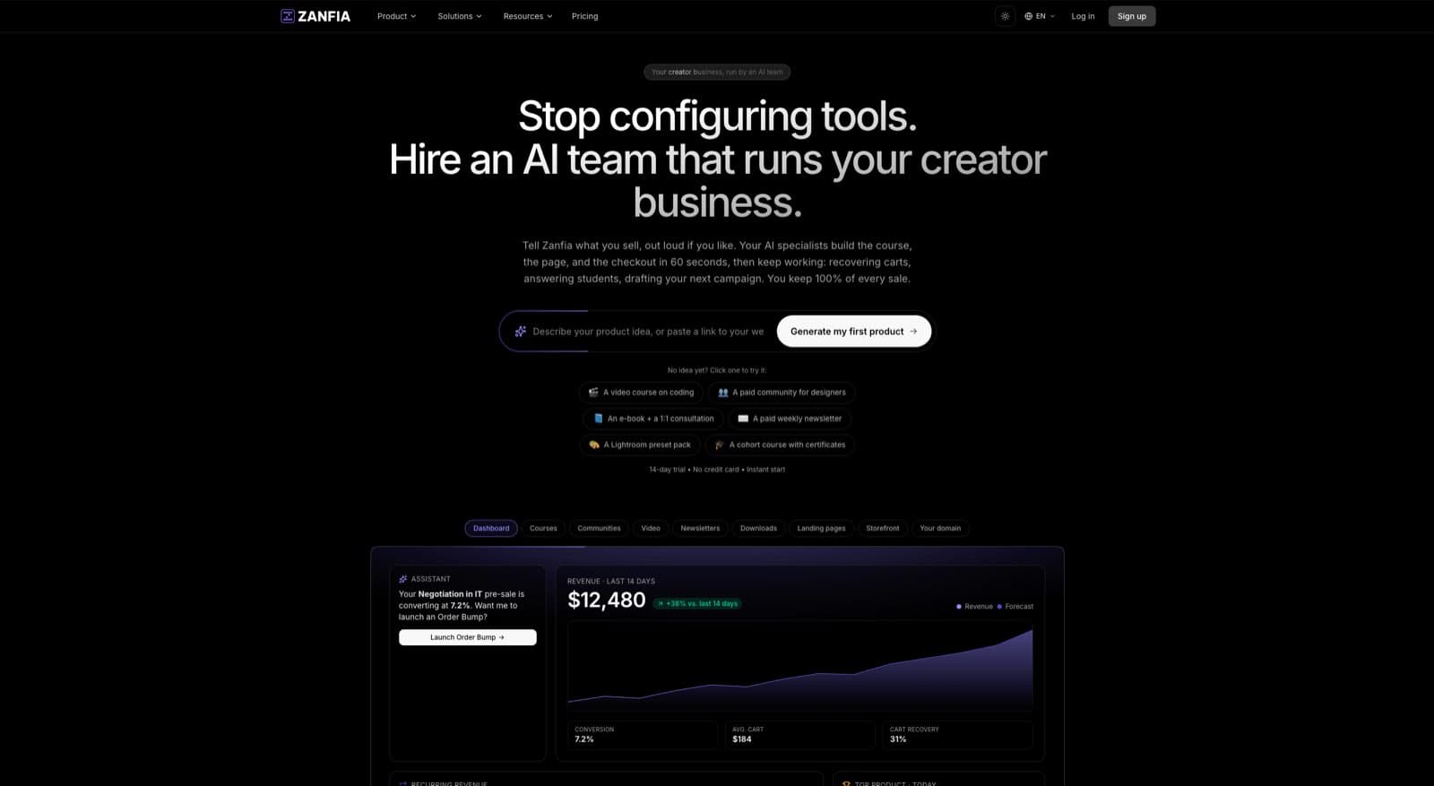
Zanfia is set up as an AI team that runs the creator business, and a platform second. Instead of stitching together a checkout tool, a course host, a community app, and an automation engine, you brief the AI team by chat or by voice and it performs any action available in the interface, from spinning up a new product to configuring a workflow after a purchase. Courses, communities, paid newsletters, downloads, knowledge libraries, subscriptions, analytics and branded checkout all live under your own domain, and you can plug your own agents in through the MCP endpoint on higher plans. See the current Zanfia pricing for what each plan includes. The current commission model is 0% on customer sales, so revenue stays with the creator, outside standard payment processor costs.
That setup changes how the thank you page performs. Instead of sending buyers across disconnected tools, the page can point into the same environment that handles access, onboarding, and retention. The checkout is built to sell: order bumps, upsells, and installment plans that let you split a $600 course into four payments, plus a test mode so you can run a real test purchase on your own product before the first buyer sees it. The result is a more consistent customer experience and fewer breakpoints after payment.
I have seen this matter most with bundled offers. A creator sells a workshop, a newsletter tier, and community access in one checkout. Without automation, that sale creates three separate fulfillment jobs. With Zanfia workflows, the thank you page can confirm the bundle while the platform handles enrollment, permissions, and messaging in the background, and the creator can dictate the follow-up instead of clicking through menus.
Scale usually breaks in operations first
Low-volume businesses can survive manual fulfillment for a while. Growth exposes the cracks.
Post-purchase automations often save hours each month because they remove repetitive access updates, onboarding tasks, renewal handling, and support cleanup. More important, they protect the customer experience during launches and promotions when volume spikes and small mistakes multiply.
For practical workflow ideas, review these marketing automation workflow examples for creators.
The thank you page is where buyers judge whether your business feels organized. Good design helps. Reliable automation keeps the promise.
Measure What Matters: Tracking and A/B Testing
Most creators judge thank you pages by feel.
That’s risky. A page can look polished and still underperform. Another can feel plain and still drive more upsells, more community joins, and better activation.
The fix is simple. Treat the thank you page as a measurable checkpoint.
Track the page as a real conversion endpoint
A dedicated thank you page works well for measurement because it creates a clean destination event.
That gives you a place to attach analytics pixels and conversion goals. It also helps distinguish between people who visited a sales page and people who completed the action.
The tracking side matters beyond basic reporting. Thank you pages are critical for advanced tracking. By placing analytics pixels on them, creators can collect data for retargeting, measure the lifetime value of community subscribers, and identify warm leads. A/B testing pixel events for different upsells on this page has been shown to boost LTV by up to 35%: https://spiderworking.com/blog/2019/08/13/are-you-neglecting-your-thank-you-page/
That changes the role of the page. It’s no longer just where conversion is acknowledged. It’s where post-conversion data starts getting useful.
What to measure first
You don’t need a giant dashboard on day one.
Start with a short list of decision-making metrics:
- Primary conversion completion: Did users reach the thank you page after the intended action?
- Second action rate: Did they click into the course, join the community, or take the upsell?
- Offer-specific clicks: Which CTA gets attention?
- Segment quality: Which lead source produces users who take the next step?
- Drop-off patterns: Where does momentum fade after the page?
If you’re using an internal analytics setup alongside external tools, compare both views. External pixels help with campaign attribution and retargeting. Internal funnel data helps explain product usage and onboarding behavior. You need both perspectives if you’re selling subscriptions or community access.
For broader experimentation discipline, this article is worth reviewing: https://zanfia.com/blog/conversion-rate-optimization-strategies/
Good A/B tests are narrow
Most page tests fail because creators change too much at once.
Don’t test the entire page against a completely different page unless traffic volume is strong and the hypothesis is clear. Start with one variable that affects one behavior.
Good candidates include:
| Test idea | What you’re learning |
|---|---|
| Headline wording | Does reassurance beat excitement? |
| Primary CTA text | Which promise gets more clicks? |
| CTA placement | Do users act faster when the button appears sooner? |
| Offer type | Does a community invite outperform a cross-sell? |
| Access-first vs upsell-first order | Does activation increase when the product comes before promotion? |
Common mistakes that skew results
A thank you page is easy to over-optimize badly.
Watch for these problems:
- Testing too many variables at once: You won’t know what caused the change.
- Ignoring user intent: A course buyer and a free subscriber shouldn’t see the same post-conversion logic.
- Chasing vanity clicks: More button clicks don’t matter if downstream retention gets worse.
- Breaking the trust moment: Aggressive offers can reduce confidence right after payment.
- Forgetting implementation checks: Test that the page fires only after successful submission or purchase, not on failed attempts.
If the thank you page is important enough to carry revenue opportunities, it’s important enough to measure like a revenue asset.
The best tests usually improve clarity, not cleverness.
Transforming Gratitude into Growth
A thank you page can be a receipt, or it can be part of the business.
The weak version confirms a transaction and sends people away. The stronger version confirms the action, starts onboarding, drives the next click, and feeds your analytics with clean data. That’s a very different job.
For creators selling digital products, courses, subscriptions, and communities, that difference shows up in three places. More activation. Better retention. More revenue from people who already trust you.
The practical takeaway is straightforward. Build the page for the moment the user is in. If they just subscribed, guide them. If they just bought, get them into the product. If they’re ready for a second action, offer one that fits the original intent.
The same principle applies outside the page itself. If you also run events, workshops, or community sessions, your follow-up communication needs the same clarity. This guide to an effective thank you email post-event is a useful companion because it applies the same post-conversion logic to email.
A lot of creators spend months fixing acquisition and barely touch the moment after conversion. That’s backwards. You’ve already paid for attention. You’ve already earned trust. The thank you page is where you stop wasting both.
Frequently Asked Questions
What is the ideal number of primary calls-to-action on a thank you page?
One. The article recommends a single main CTA because the first click after conversion should be directed, and multiple equal-weight buttons create hesitation. Secondary links can exist, but they should never overpower the primary action.
Why is a dedicated thank you page URL better than an inline confirmation message?
Dedicated pages serve as high-engagement, standalone touchpoints and support analytics properly. Platforms like Google Analytics require a unique thank you page URL to accurately log conversions and track user paths, something inline confirmations often miss.
How should the primary CTA differ depending on the type of conversion?
Match the CTA to the buyer's state. If the product needs activation, send them straight to it (for example, 'Start lesson one'). If it benefits from social momentum, send them into the community. If the relationship is still early, offer a relevant bridge product like a starter workshop or paid newsletter.
Why does mobile optimization matter so much for thank you pages?
According to ThriveCart, 65% of digital product purchases happen on mobile, and thank you pages typically see around a 50% bounce rate. Keeping the confirmation high on the screen, making CTAs thumb-friendly, and placing them above the fold can significantly reduce that bounce rate.
What backend work should the thank you page trigger after a purchase?
The page should act as a trigger point that grants product access immediately, sends the correct welcome email, routes the buyer into the right course or member area, applies community roles or permissions, and handles renewals or failed payments without manual cleanup. If those tasks depend on manual action, scale gets expensive and trust erodes fast.
What’s the difference between a thank you page for a free lead magnet and a paid product
The intent is different, so the page should be different.
For a free lead magnet, the priority is delivery and a light next step. Confirm the signup, explain where the resource is being delivered, and point to one related action such as reading a related article, joining a waitlist, or watching a short training.
For a paid product, the priority is activation. Confirm the purchase and get the buyer into what they paid for as fast as possible. That usually means direct access, onboarding guidance, and support information if anything goes wrong.
Can I put more than one CTA on the page
Yes, but only one should be dominant.
A good rule is to choose one primary action and keep the rest visibly secondary. If every button has equal visual weight, users hesitate. If your primary goal is course activation, the “Start now” button should clearly outrank “Follow on Instagram” or “Share with a friend.”
If you need multiple options, structure them by priority instead of presenting them as equals.
Should I put an upsell on every thanks you page
No.
Some conversions call for an upsell. Others call for product access, reassurance, or orientation. If you upsell too early, especially right after payment, you can make the customer feel sold to instead of supported.
The better question is whether the upsell helps the user succeed with what they just bought. If yes, it can fit. If not, it’s probably noise.
Do I need a separate URL for the page
In most setups, yes. A dedicated URL makes tracking cleaner and avoids the limitations of inline confirmation messages. It also gives you a stable destination for pixel events, conversion goals, and funnel analysis.
What should happen after the page from an operations standpoint
Delivery should already be in motion.
That includes access, welcome emails, product permissions, and any post-purchase administration. If your platform can grant access, add community roles, kick off the welcome sequence, and adjust permissions when a plan changes, all from a single post-purchase workflow, you remove most of the manual cleanup that usually piles up after a launch.
How branded should the page be
As branded as the rest of the customer journey.
The thank you page shouldn’t feel like a detached utility screen. If you’re building under your own domain with white-label control, keep the same tone, visual identity, and product promise. Consistency lowers friction and reinforces trust right after conversion.
If your current Zanfia funnel ends with a dead-end confirmation screen, that’s fixable. Build a thank you page that confirms the action, starts onboarding, supports measurement, and connects to the AI team and workflows already running in the background. If you sell courses, memberships, paid newsletters, or downloads, doing this inside one branded system with custom domain control, voice-ready control from chat or dictation, and a 0% platform commission on customer sales helps you keep both the customer experience and the revenue you’ve earned.